One of my favorite challenges is to create the information layout of web sites. I’ve worked on similar projects numerous times, and each situation has it’s own caveats. However, especially working on sites in the present day, the one major fact that I have learned is that people, when using the web, don’t read. They scan.
Jakob Nielson, a well-known usability professional, has published findings indicated that people rarely read Web pages word by word; instead, they scan picking out individual words and sentences.
When working on re-creating a major website used by fiscal specialists at the UW, we had to make some decisions as to how information was displayed. Some of the questions that were posed included:
- How much do people want in one visit? How connected is the information?
- Am I overloading my site visitors? How long is the web page?
- What’s the download time? (We have many users who are overseas and may have expensive internet time)
- Will people want to print? How much will they want to print?
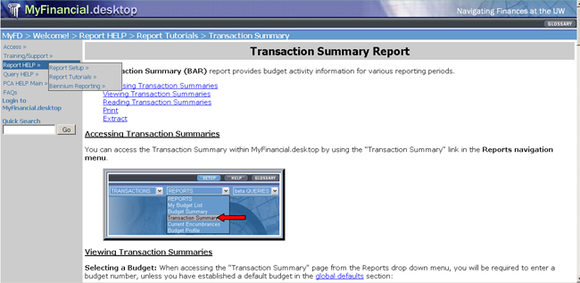
Here was the original site.
Notice how long the page is based on the scroll bar!

Working to re-create the site with an easier (and more modern) site, there were a few objectives in mind. This included:
- Breaking up large documents. We wanted to think “topics,” not “book”. This required the division of web content by time or sequence, task, people, type of information and to consider the kinds of questions people ask
- Decide how much to put on one web page. Considerations were placed on deciding how much information people wanted in one visit, how connected the information was, how long the web page was and if users will have the desire to print the information for future reference

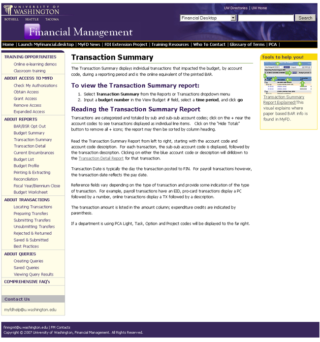
The new site was a much more organized view of the same information. However, we were also able to incorporate University branding into the site as well. In addition, multi-media content was added, such as e-Learnings and handouts to help aid users to use the financial system.
Feedback was phenomenal. Users appreciated the simple breakdown of information, and the yellow callouts on the right side of the screen for additional aids.
